
contents page
how i started off

|
On my first contents page i started off with two pictures i had taken on different days. At this point i didn't know how i wanted my pictures to be or how and what color scheme i wanted to use so i decided to look at my front cover and decided to add the flowers. this accompanied the house style and enhanced the pictures i then decided to take from there; below are the photos i then took for my contents page the color scheme i went for was yellow.
|
photography

|
This is a very rough layout of how i want my my contents page to be.
|

|

|
location
|
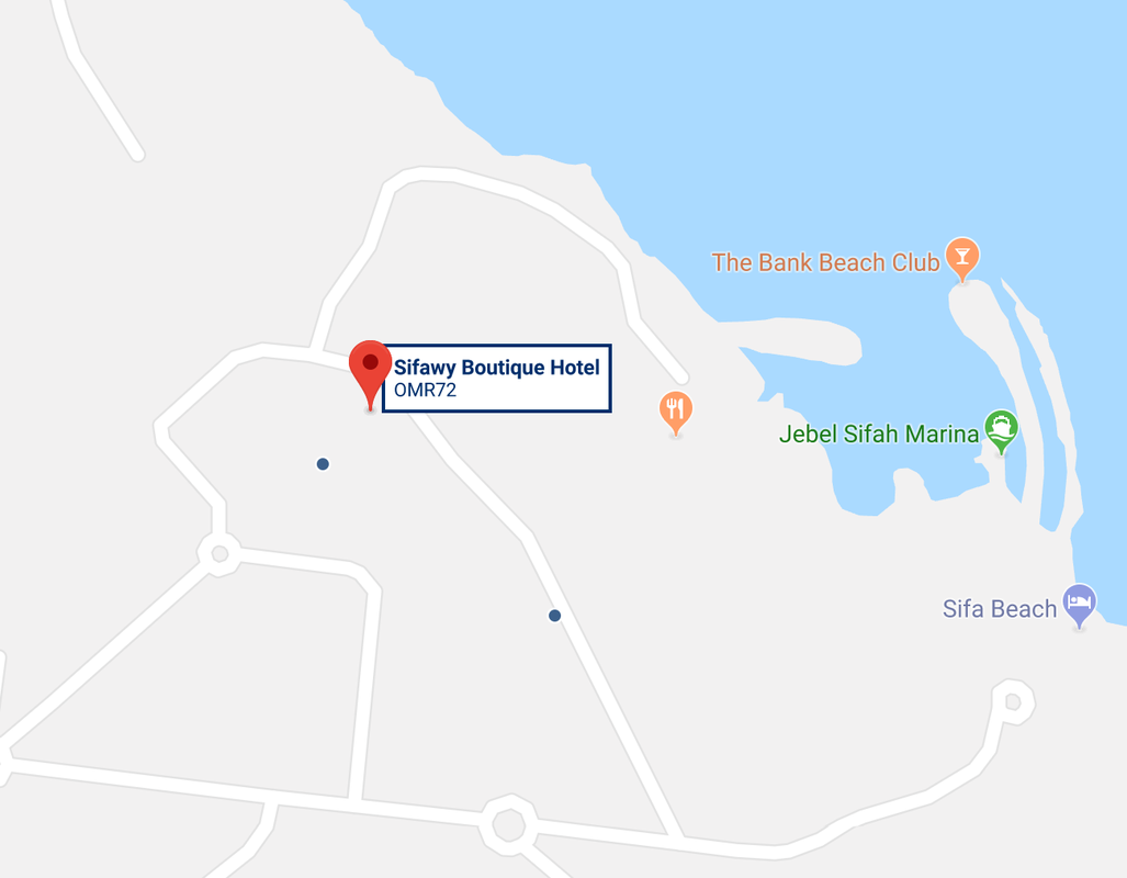
Sifa beach
Resort Sifawy Boutique Hotel; this is where i took the photos for my contents page 
|

|
|
With my contents page i took some images i had taken on a trip to the beach, i also included one of the models images. i then took the texts from my front page and put them on one A3 photoshop page to get my ideas and color, theme sorted out. initial ideas: i stuck to the same sell lines (theme).
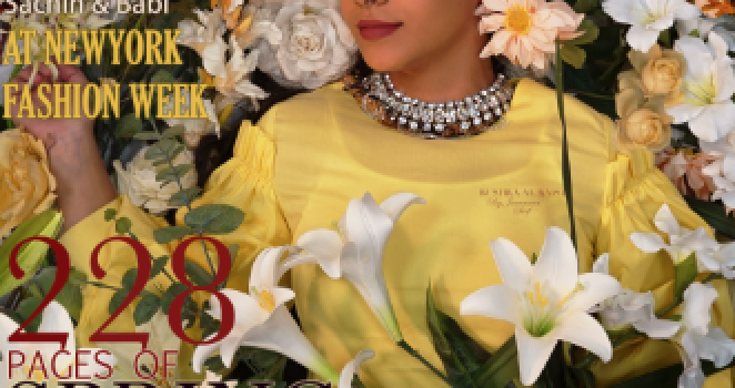
As you can see in this image i had taken two of my favorite photos, from my trip and then i also used my models photo. previously i said the pictures that i took landscape of my model looked dull. i took the image and edited it to make it fit with the yellow color scheme i was working with. i also increased the brightness. i put the images over each other since i liked the idea of a collage, this helped bring in the yellow from the flowers. to make the models photo fit in more i added yellow flowers on the corner to make it look like it was combined together and didn't look lonely just on the corner. |

|
why?
The reason i stuck to a yellow color scheme was because that color is very in right now and i had clothes matching it and i thought this would fit it very well with my theme. the images i think represent a very abstract idea since the background was a building with very sharp cuts and edges. i chose the photos specifically because they stood out the most and had very good (natural) lighting. in the other images i had taken i would've had to edit all of them to make them fit well with the page. another thing i also liked were the shadows it again looked effortless and doesn't look fake like i have used a green screen.
My initial idea was to have a double page spread and do my contents page like the photo above then i realized the photos i had taken weren't of very high quality. And didn't look good on a double page spread. the photos looked very lonely and I would have to add a long description of the pages that would be included in my magazine.
|
Now in the photo on the side i added the sell lines stories I had on my contents page and chose to make the numbers black and white since theres already a lot color thats been introduced in my front cover and contents page now.
as you can see already that yellow was the main focus this helped create a stronger house style with the flowers accompanying it. Because the brightness and edit looked a bit flushed out i had to move the layers around so the images got the same contrast. Here you can see that the yellow flower images were too sharp and squared i wanted to add more to it. The idea that came to mind was; (shown below) |

|
different fonts on the page
Numbers: Hoefler Text
Stories: Adobe Heiti Std
Stories: Adobe Heiti Std
i found it very tricky to cut and copy paste and drag the image to another tab so i had to watch the videos again.

|
In this image i have added the sun flowers to the image so the image has its own house style, the contents page looked like a very strong collage before and i think because of the flowers its all tied up. this took me a while since the flowers had to be cut properly and put in places to look like a bail.
i kept all the sell lines and stories in the same places and didn't let the flower cut outs get in the way of them and the color used for them. |
|
On this page i have finished adding all the flowers on my page and i think all the places it is at looks pretty good. something that does annoy me is how i cut the flowers i wish it was neater and sharper so it didn't show the green bit or the darker part of the image where the flowers were on top of each other and the shade was on top therefore it made it darker.
i also think i should've added more green, some how in my pictures because personally the models photos is still sticking out to me. And i also think the background should be lighter since it looks very peachy right now. |

|
draft

|
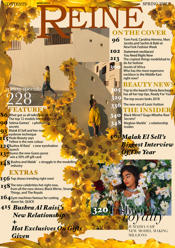
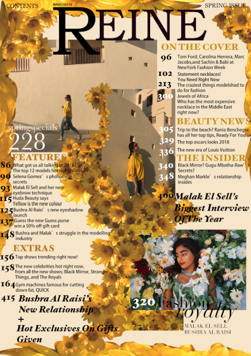
This is my final piece as you can see the main stories are of the models i had used for my front cover and my contents page. My magazine consists of 415 pages. and all the stories i have included are all recents. the background i made it a little lighter than the first and throughout i have stuck to my yellow theme.
|
final draft
|
In my final i removed contents March 2018 because it was together and i put contents on the top left corner to make it look more visible. I removed the March from under the "E" because I already had it on top of the "R". I changed page 400 and 415 because i had made them green I changed them back to black.
|
|
final
|
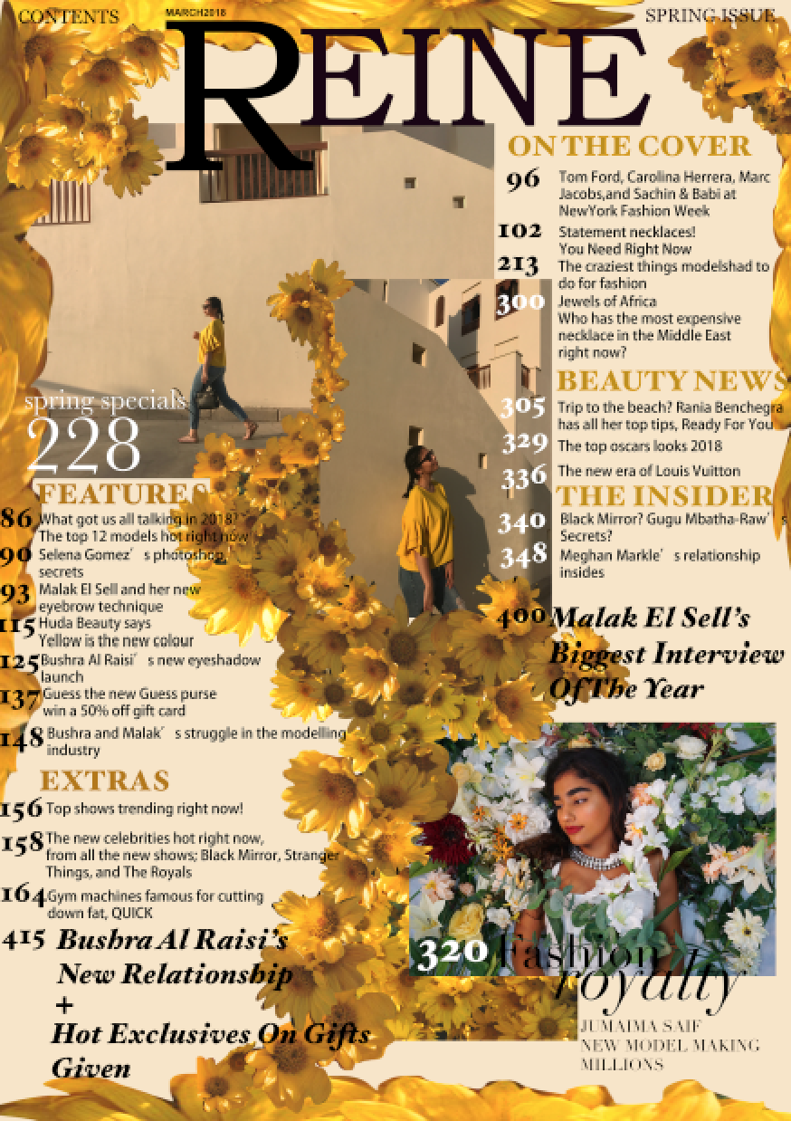
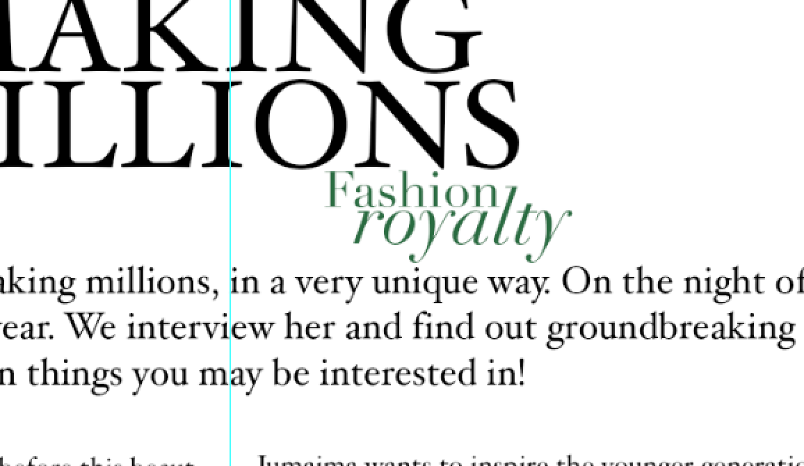
In this image i had to change one of the stories, since my article was about to be about a different model. you can see the change under the fashion royalty i changed it to "Jumaima Saif new model making millions". other than that i didn't change anything as i really like my contents page. it will engage with eh audience as it is very different and something no one was really seen before.


|
text
Direct mode of address through using "YOU" creating connection between reader and magazine. using the same amount of spaces and having a neat structure/ layout makes it look professional. subtitles are bigger than the stories so it catches the eye. i keep everything the same size as i want it to flow together and for it to look simple yet busy. the line "fashion royalty" is placed in a similar image to where the same sell line is for the front cover.
layout
layout of the page it has 3 main images focusing on the stories in the magazine which follow the color scheme. the magazines name is at the top so the audiences are reading something from my product. also included contents right at the top so the audience knows what page it is including the issue it is.
housestyle

|

|
|
